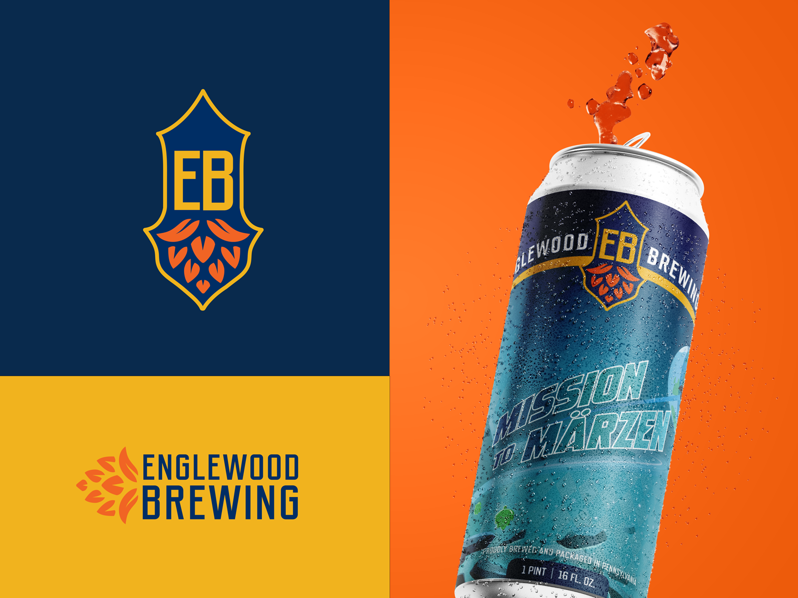
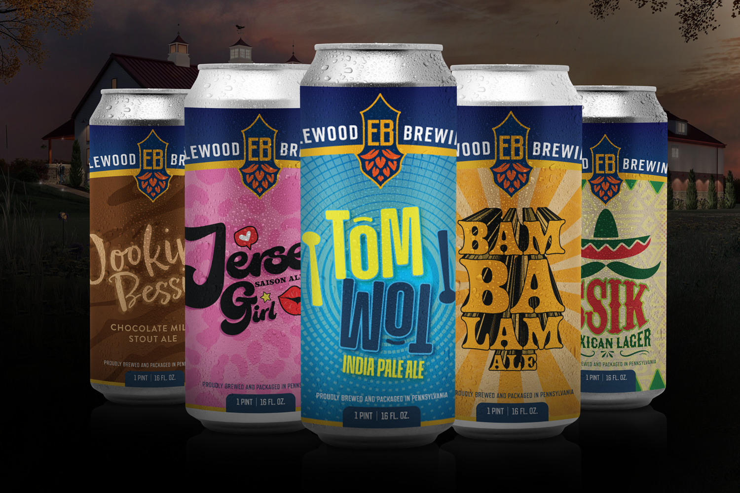
Challenge
Our Role: Design, Creative Direction
Englewood Brewery was looking to rebrand their beer cans to be more marketable and feature a more cohesive design that focused more solely on their brand. In previous designs, the Englewood brand was lost, lacking consistency in placement. They wanted the Englewood name to be apparent when the beers were sitting on a shelf.
Solution
Beer Can Label Design
While each can's design is unique and made to represent the unique names of their beers, we added the consistency they were looking for. We placed a prominent Englewood "E" at the center of every can along with the name running across the top consistently throughout every label design to push their brand identity.